 This contemporary art quilt, “Symmetrical Green Circle” is the second one I made whose image is based on spilling the contents of a trash can on to the floor. I don’t usually do symmetrical versions, finding them too difficult to line up exactly right. My eye can see slight imperfections that are off by .5 in. (1.5 cm) and I find them visually irritating. Also, given the fact that my hand applique is “consistently inconsistent” , I just don’t usually do symmetrical pieces. Still, this was back in 1984, and what did I know? I was trying to experiment whenever I could.
I was invited by Nancy Crow, an early art quilting mentor of mine, to be part of a show she was curating, “Emerging Quiltmakers”. I submitted slides of both the unfinished views of the asymmetrical and symmetrical versions of these quilts. I was sure that she would choose the asymmetrical version, and had sent that one off to Mrs. Henry Herschberger, an Amish woman that Nancy used to hand quilt for her. I was very surprised that the symmetrical version was the one chosen.
I had one month to complete the hand quilting, on this piece which is 43”W x 46”T ( 109.5 cm X 118cm) which I did and got it to the exhibition in time. I was very proud to have been given that early vote of confidence by Nancy Crow, but all of that hand quilting in such a short period of time did my wrists in. I ended up having to have carpel tunnel surgery on both wrists, and since it was a relatively new procedure, I quilted my cast and got in a number of newspapers (see previous blog.) I suppose every endeavor has occupational hazards, and I quickly found mine.
 I used a lot of the same shapes and fabrics that I had utilized in the asymmetrical version of this quilt, with the hope that one day, they would be displayed side by side. (That has yet to happen.) There is the same green circle in the middle to represent the industrial green trash can in the classroom where I was teaching. Many of the same shapes used the same fabric, and since the human eye tends to try and make familiar images out of geometric shapes, this detail shot to me looks like a person with outstretched arms and a hat with a black pom-pom. (You are of course invited to see whatever you see!) Again, as with the asymmetrical version, I used dark green thread for the hand quilting, but looking back, I’m not pleased with regard as to how the quilting lines don’t complement the hand appliqued pieces.
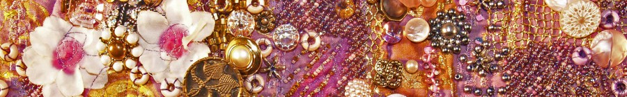
 Here is a view of the lower left of the composition. The piece basically was a central motif in the upper half with a another horizontal motif underneath. This is one of the arms that extended from the central, main design and helped to anchor the composition for me. From what I remember now, I placed the central green circle in place, and the shapes grew out organically from there. The larger pieces were placed first and then smaller and smaller ones were added on. All of the pieces were pinned in place before any sewing was done, and then I would take the board on which the quilt top was secured and put it in a place in the house where I would have to walk by it on a regular basis. I find that after two days of casual observations going about my day, I would start to see pieces that would glare out at me. “Wrong place!” they would scream at me. The problem was that they either were the wrong color, wrong placement, or something else needed to be added. I find that “living” with a piece for a few days is optimal to get the best images, but I don’t have that luxury if an exhibition is looming.
Symmetrical vs asymmetrical; which to choose? Both have their appeals to different personalities, but for myself, as my work evolved over the last 30 years, I found that I gravitated more and more toward asymmetrical pieces. For me, part of the fun is the dynamic balance of seeing how many diverse elements I can put into a composition. So, this symmetrical version gives you a glimpse into how and what I was thinking back when I was developing my artistic voice and doing a lot of experiments.
Which way do you go about creating an image for your own artistic medium? Is color your favorite design element, or texture, or line? How do you go about giving each element its due to make for a composition that is pleasing to you?
Why not leave a comment as to your thoughts on this posting. Please take a minute, fill out the form below or by clicking on the “comments/no comments link” at the top of the posting, and then share your ideas with the rest of us. We all grow when we share our thoughts and impressions, so why not join our growing community of those who appreciate art quilts and textile arts. We’d love to hear from you!… and PLEASE tell like minded souls about this blog! The more readers and contributors, the more I write.
You can see more of my art work on my web site at www.fiberfantasies.com (be patient as it loads; it’s worth it), my healing work at www.hearthealing.net and can find me on Google + , Facebook (for Transition Portals) Facebook (for Fiber Fantasies), and Twitter.
To find out how to buy my art work, please check out “How to Buy my Art Work” in the “Pages” section to the right of this blog.
Leave a Reply
You must be logged in to post a comment.